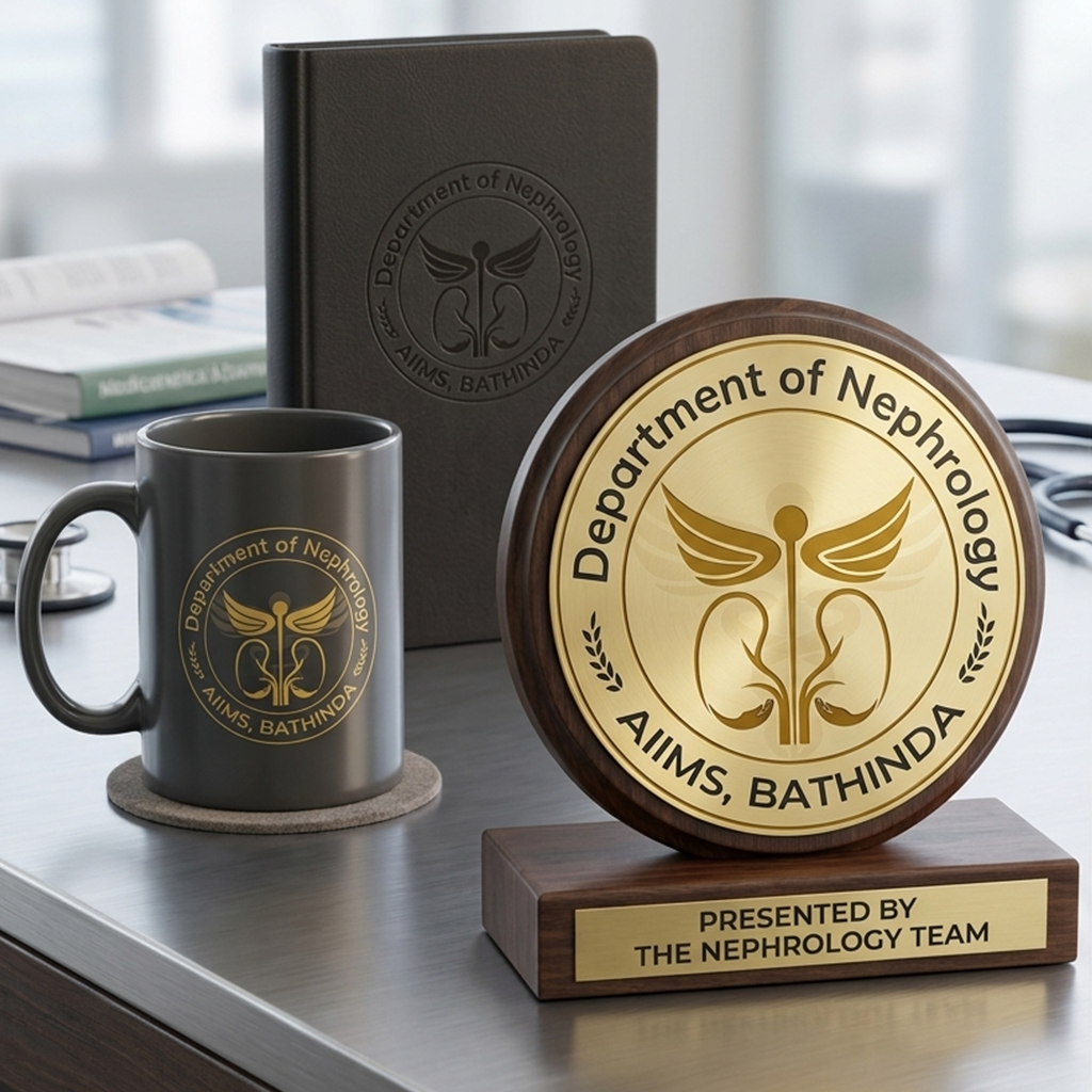
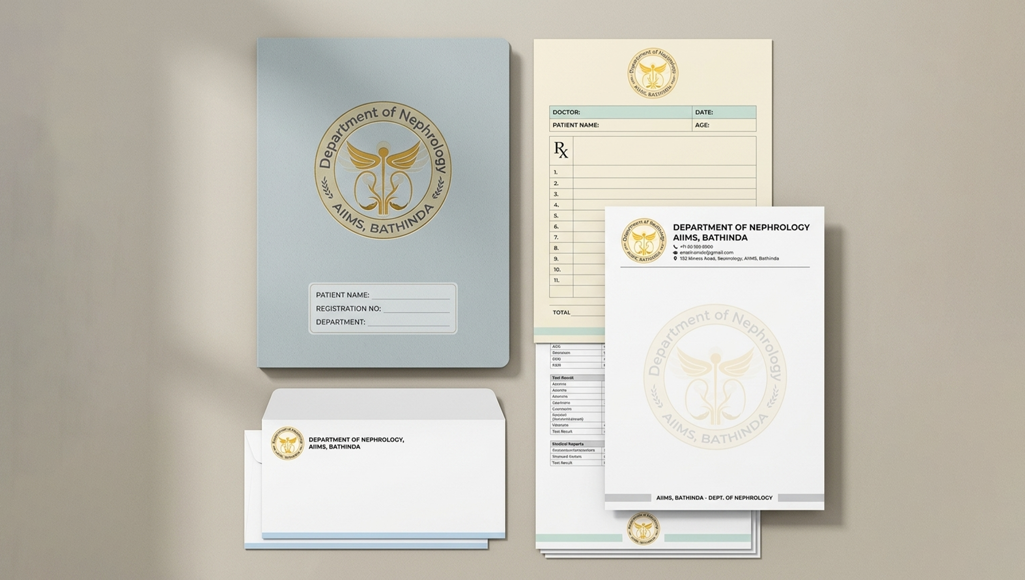
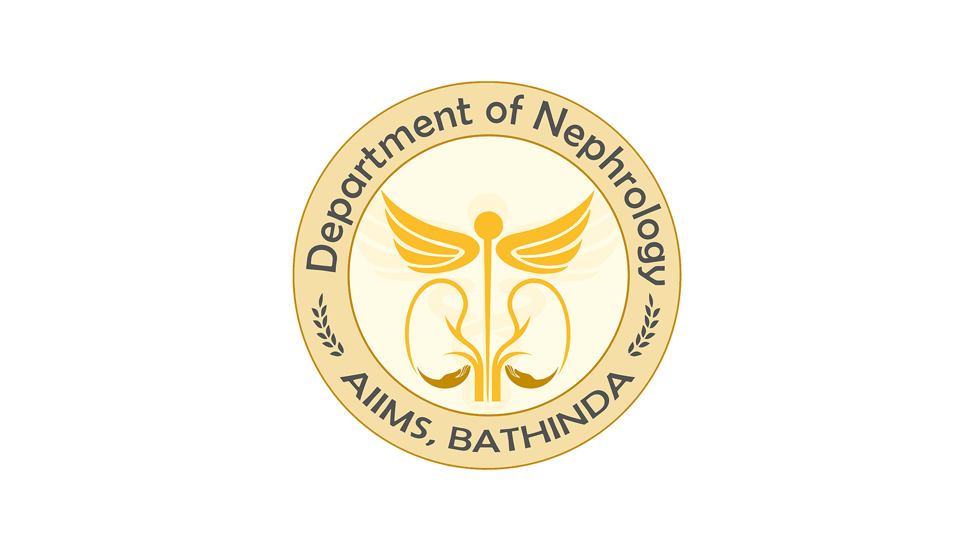
AIIMS Bathinda

AIIMS Bathinda, a distinguished healthcare institution under the Pradhan Mantri Swasthya Suraksha Yojana (PMSSY), is at the forefront of delivering exceptional medical care and research. Within the institute, the Department of Nephrology plays a vital role in providing advanced kidney care, combining medical excellence with compassionate service. The department is dedicated to improving patients’ quality of life through cutting-edge treatments, research, and preventive health initiatives.

Client
AIIMS Bathinda
Timeline
2 Weeks
Year
2019
Services
Logo Design

Project Overview

For this project, I was commissioned to design the official logo for the Nephrology Department at AIIMS Bathinda. The objective was to create a visual identity that captures the department’s commitment to medical precision, patient care, and institutional integrity. The logo needed to embody trust, professionalism, and the essence of nephrology while aligning with AIIMS’s overarching identity as a leading national healthcare institution.

The Challenge

Designing a logo for a medical department demanded a thoughtful approach that balanced emotional resonance with professional rigor. The challenge lay in developing a design that conveyed scientific excellence and compassion simultaneously. It had to be symbolic yet simple, ensuring clarity and adaptability across multiple applications—from official documents and reports to signage and digital platforms—while maintaining consistency with the AIIMS brand values.

Design Approach

The design drew inspiration from nephrology’s core focus—the health and functionality of the kidneys. I integrated symbolic curves and organic shapes representing dual kidneys into a structured, circular form that evokes unity and care. The color palette incorporated shades of blue and maroon, reflecting trust, vitality, and medical authority. A clean, serif typeface was chosen to convey institutionality and professionalism. Together, these elements created a logo that feels both authoritative and empathetic, mirroring the department’s balance between advanced science and humane care.

Hybrid Typography Concept

The logo creatively blends Hindi and English letterforms to form the word ABHYUDAYA, giving it a distinctive ethnic-modern identity. The opening “A” is replaced with the Hindi “अ”, while “BHYUDA” is written in English but styled with Hindi-inspired curves and strokes. The ending “YA” is replaced with the Hindi “य”, completing the fusion. This thoughtful mix represents cultural roots combined with contemporary expression.

Ethnic-Inspired Letter Styling

Although most characters are English, their Devanagari-like structure gives the wordmark a traditional Indian feel while remaining accessible to a wider audience. The flowing strokes symbolize heritage, innovation, and youthful energy.

Headline Shirorekha (Top Bar)

A continuous horizontal line runs across the top of the wordmark, inspired by traditional Devanagari script structure. This element visually unifies the letters while representing connection, stability, and forward momentum—key values of a tech-driven festival.

Modern “TechFest” Accent

“TechFest” appears in a clean, minimal sans-serif font on the upper right, providing contrast to the ethnic main lettering. This modern touch reinforces the technological aspect of the event while balancing tradition with innovation.

Tagline

The tagline “Enliven Your Mind” captures the core philosophy of Abhyudaya TechFest—encouraging creativity, innovation, and intellectual awakening. It reinforces the festival’s purpose of inspiring young minds through technology and learning.

Conceptual Meaning

The name Abhyudaya signifies growth and upliftment, and the hybrid typography visually communicates this idea—bridging tradition and technology, culture and creativity, past and future.

Print & Promotional Design

I designed and developed the complete visual identity for Abhyudaya, emphasizing themes of innovation, creativity, and campus spirit through polished typography, vibrant graphics, and event-specific motifs. This included a cohesive digital presence with social media assets and a variety of print materials such as posters, banners, certificates, event flyers, and merchandise, ensuring consistent branding across all touchpoints. Each asset was carefully crafted to reflect the fest’s energetic and inclusive atmosphere while maintaining a unified visual language, creating a high-impact and memorable experience for participants and attendees alike.