Abhyudaya

At Abhyudaya, first started in 2018, we celebrate the fusion of technology, culture, and creativity, providing students of Punjabi University, Patiala, with a platform to showcase their talent and innovation. The fest is designed to encourage collaboration, inspire curiosity, and foster a spirit of healthy competition, while creating a memorable and inclusive experience for the campus community. Through thoughtfully curated events, performances, and competitions, Abhyudaya empowers students to explore their potential, express their creativity, and build meaningful connections across disciplines.

Client
Abhyudaya (Tech-Fest)
Timeline
1 Months
Year
2018
Services
Logo Design

Project Overview

"This case study explores the comprehensive process of branding, visual design, and promotional material creation for Abhyudaya, the annual tech and cultural fest of Punjabi University, Patiala. It highlights how a cohesive design approach was applied across the fest’s identity, ensuring a visually engaging and memorable experience for participants and attendees alike. From designing the logo and coining the tagline to creating digital and print promotional assets, every element was crafted to maintain a unified and impactful visual language. The seamless integration of these design components, coupled with strategic creative direction, helped establish a strong and recognizable brand identity for the fest, elevating its presence on campus and beyond."

The Challenge

The development of Abhyudaya’s branding and promotional strategy presented several key challenges. First, creating a cohesive visual identity for a diverse range of events—tech competitions, cultural performances, and creative showcases—required balancing creativity with clarity, ensuring each event retained its unique appeal while fitting into the overall fest theme. Managing timelines and coordination across multiple teams was another critical challenge, as the first edition involved designing the logo, coining the tagline, and producing all promotional assets from scratch. Additionally, maintaining consistency across digital and print platforms, while making the branding engaging and memorable for a wide campus audience, demanded careful planning and precise execution.

My Approach

To craft Abhyudaya’s visual identity and promotional strategy, I led a structured and collaborative design process that ensured consistency and impact across all touchpoints. For the first edition, I began by conceptualizing the logo and coining a tagline that encapsulated the fest’s spirit of innovation and creativity. Each event was visually mapped with custom assets—digital posters, social media graphics, and print materials—that maintained a cohesive theme while highlighting individual event identities. In the second edition, taking full charge as the fest organizer, I oversaw the end-to-end creative direction, coordinating with multiple teams to streamline timelines, ensure brand consistency, and elevate the overall participant experience. Across both editions, attention to detail, a clear visual hierarchy, and a focus on audience engagement guided every design and execution decision, resulting in a unified, high-impact presence for the fest on campus.

Impact & Results

Abhyudaya’s refreshed branding and cohesive promotional strategy significantly enhanced the fest’s visibility and engagement on campus. The logo, tagline, and unified design elements helped establish a recognizable identity, while well-crafted digital and print assets encouraged higher student participation and audience interaction. By streamlining creative processes and maintaining consistent messaging across all platforms, the fest achieved a professional and memorable presence, leaving a lasting impression on participants and attendees alike.

200%
Participation
15k+
Engagements
4.8
Satisfaction
-50%
Workload Reduction

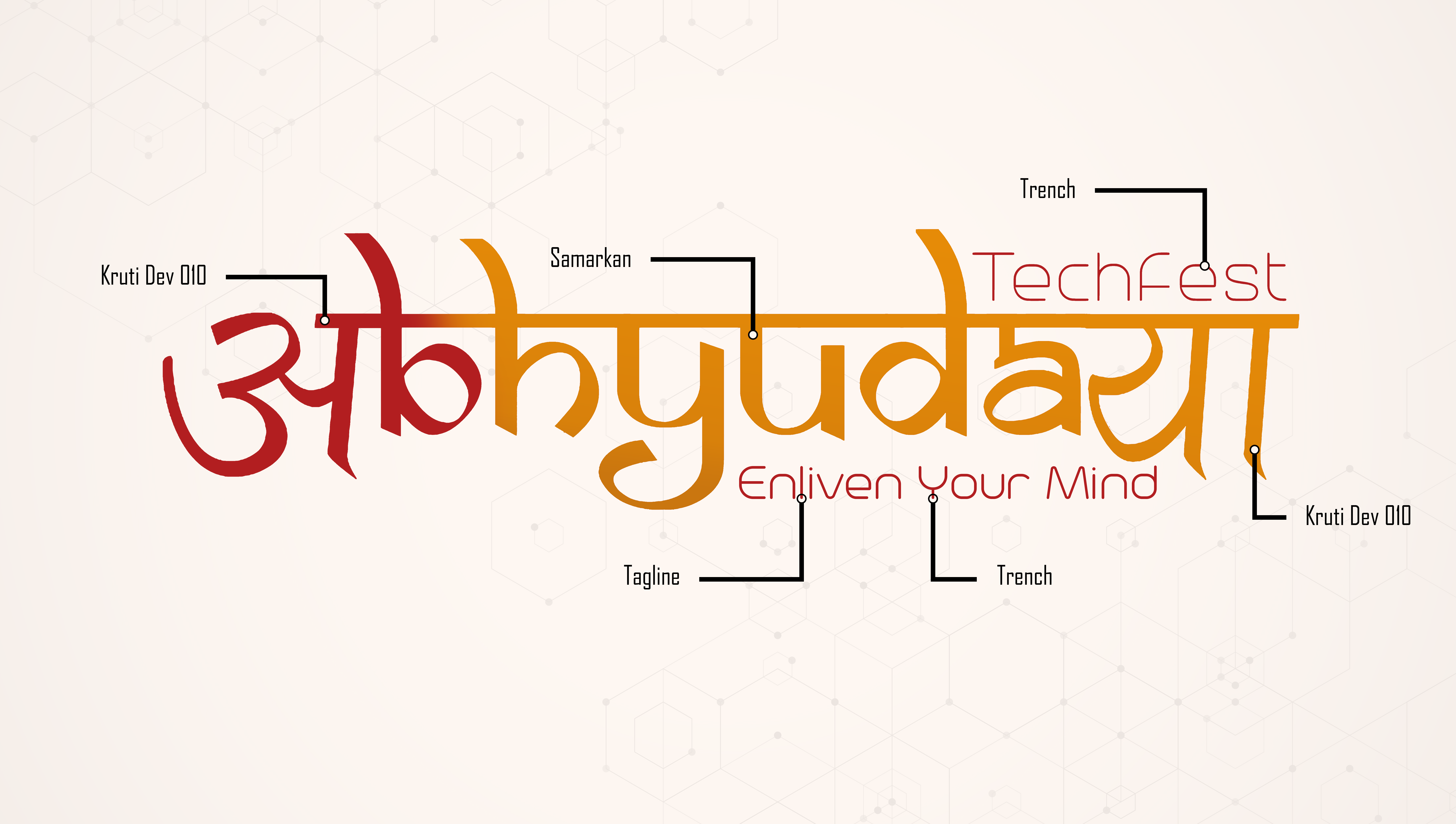
Hybrid Typography Concept

The logo creatively blends Hindi and English letterforms to form the word ABHYUDAYA, giving it a distinctive ethnic-modern identity. The opening “A” is replaced with the Hindi “अ”, while “BHYUDA” is written in English but styled with Hindi-inspired curves and strokes. The ending “YA” is replaced with the Hindi “य”, completing the fusion. This thoughtful mix represents cultural roots combined with contemporary expression.

Ethnic-Inspired Letter Styling

Although most characters are English, their Devanagari-like structure gives the wordmark a traditional Indian feel while remaining accessible to a wider audience. The flowing strokes symbolize heritage, innovation, and youthful energy.

Headline Shirorekha (Top Bar)

A continuous horizontal line runs across the top of the wordmark, inspired by traditional Devanagari script structure. This element visually unifies the letters while representing connection, stability, and forward momentum—key values of a tech-driven festival.

Modern “TechFest” Accent

“TechFest” appears in a clean, minimal sans-serif font on the upper right, providing contrast to the ethnic main lettering. This modern touch reinforces the technological aspect of the event while balancing tradition with innovation.

Tagline

The tagline “Enliven Your Mind” captures the core philosophy of Abhyudaya TechFest—encouraging creativity, innovation, and intellectual awakening. It reinforces the festival’s purpose of inspiring young minds through technology and learning.

Conceptual Meaning

The name Abhyudaya signifies growth and upliftment, and the hybrid typography visually communicates this idea—bridging tradition and technology, culture and creativity, past and future.

Typography

The typography of Abhyudaya Techfest is thoughtfully designed to reflect a seamless fusion of tradition and innovation. I used Kruti Dev 530 for the Devanagari letters “अ” and “य”, which replace the first “A” and the ending “YA” in the name, creating a strong cultural anchor while preserving the readability of the word in its hybrid form. The central portion “BHYUDA” is set in Samarkan, a stylized typeface that carries a Devanagari-inspired aesthetic in English lettering, allowing the logo to visually bridge Hindi and English in a cohesive manner. For the tagline “Enliven Your Mind,” I selected Trench, a clean and contemporary font that adds clarity and modern sophistication, balancing the expressive character of the main logotype. Together, these typefaces establish a distinctive identity that embodies Abhyudaya Techfest as a celebration of cultural roots powered by forward-thinking technology.