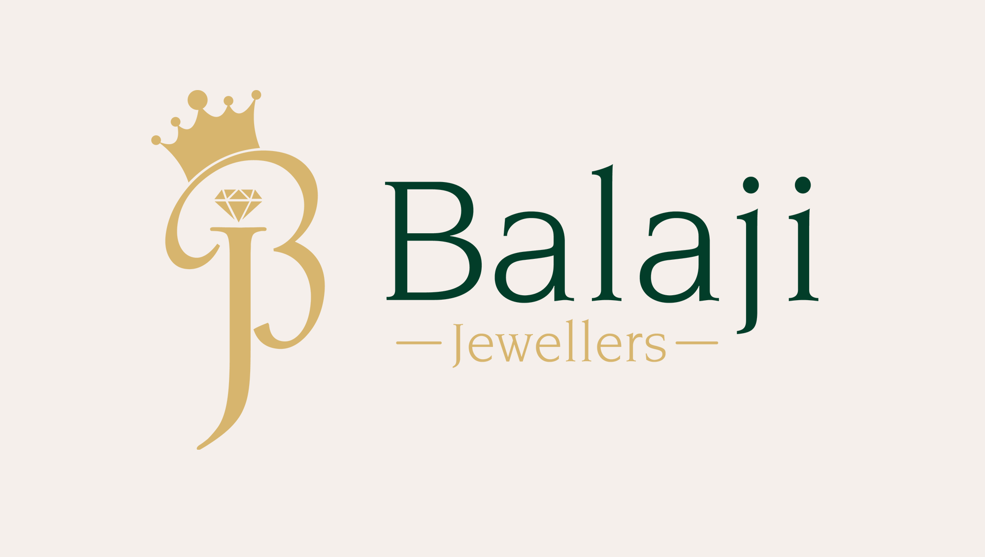
Crown Icon
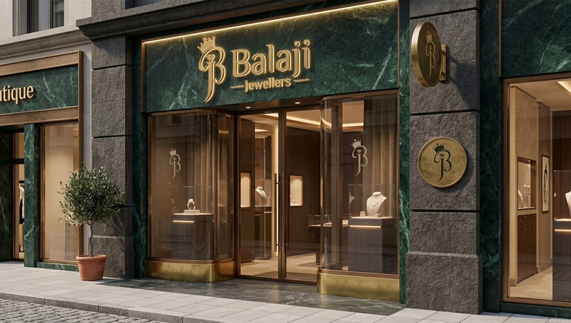
Positioned prominently on the left side, the golden crown symbolizes royalty, prestige, and excellence. Its elegant form adds a luxurious touch, reinforcing the brand’s identity as a refined and high-quality jewellery business.

Balaji Jewellers is a traditional jewellery store celebrated for its craftsmanship, trust, and timeless elegance. Rooted in cultural heritage and authenticity, the brand offers finely crafted jewellery pieces that symbolize beauty, tradition, and pride. With a strong commitment to quality and detail, Balaji Jewellers has built its identity around creating meaningful ornaments that carry both emotional and cultural value.
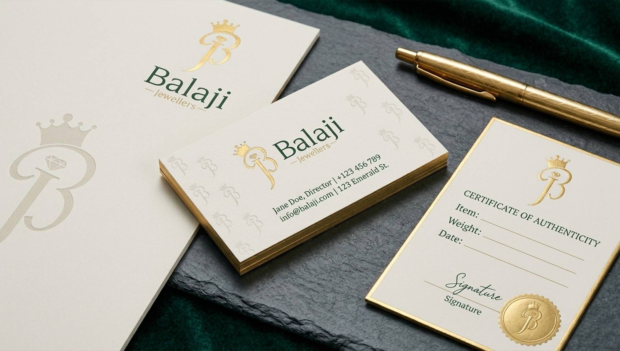
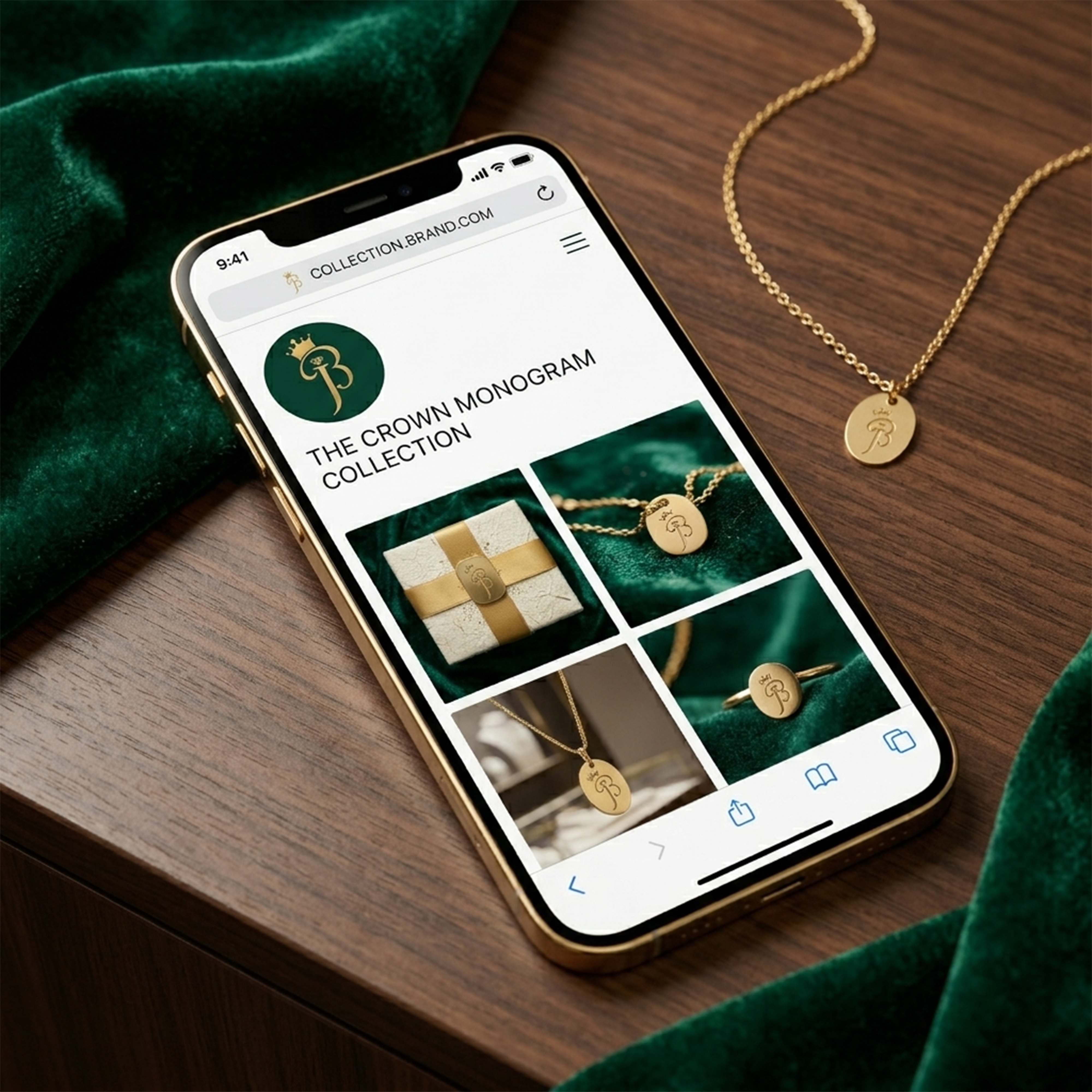
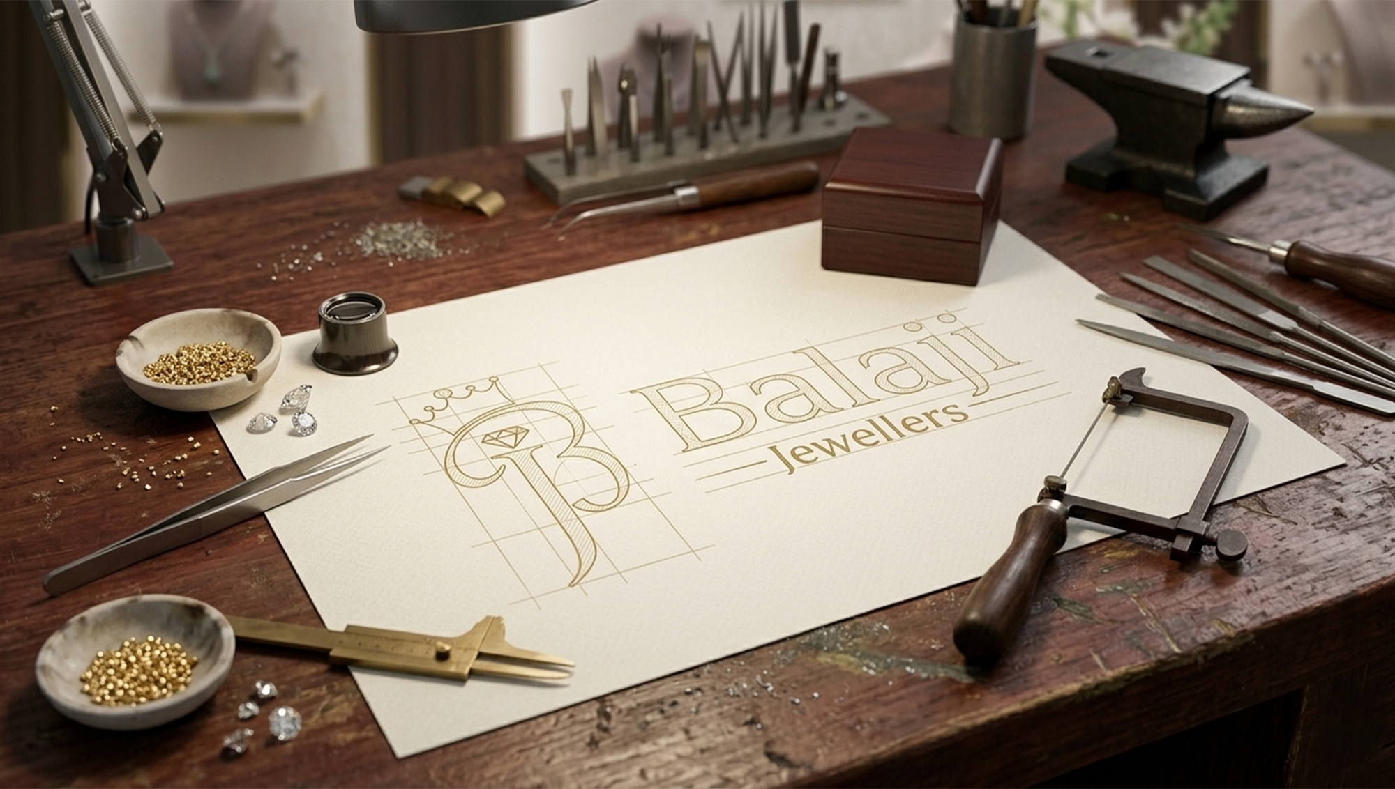
The goal of this project was to create a logo identity that reflects the brand’s rich heritage while maintaining a refined and modern appeal. My focus was on designing a mark that communicates trust, elegance, and craftsmanship—core values that define Balaji Jewellers. The identity needed to feel timeless and premium while remaining versatile enough to work seamlessly across storefronts, packaging, print materials, and digital platforms. The overall visual direction aimed to balance traditional symbolism with contemporary simplicity, ensuring the brand appeals to both classic and modern audiences.
Designing for a jewellery brand requires more than visual elegance—it demands a sense of authenticity and trust. The challenge was to create a logo that feels luxurious without becoming overly decorative or outdated. Since jewellery is deeply connected to culture, emotions, and celebrations, the identity needed to preserve a traditional essence while still appearing clean and relevant in today’s market. Another important aspect was versatility. The logo had to maintain clarity and sophistication across multiple applications, from signage and business cards to jewellery boxes and social media branding. Achieving a balance between intricate cultural inspiration and minimal modern design was key to the project’s success.
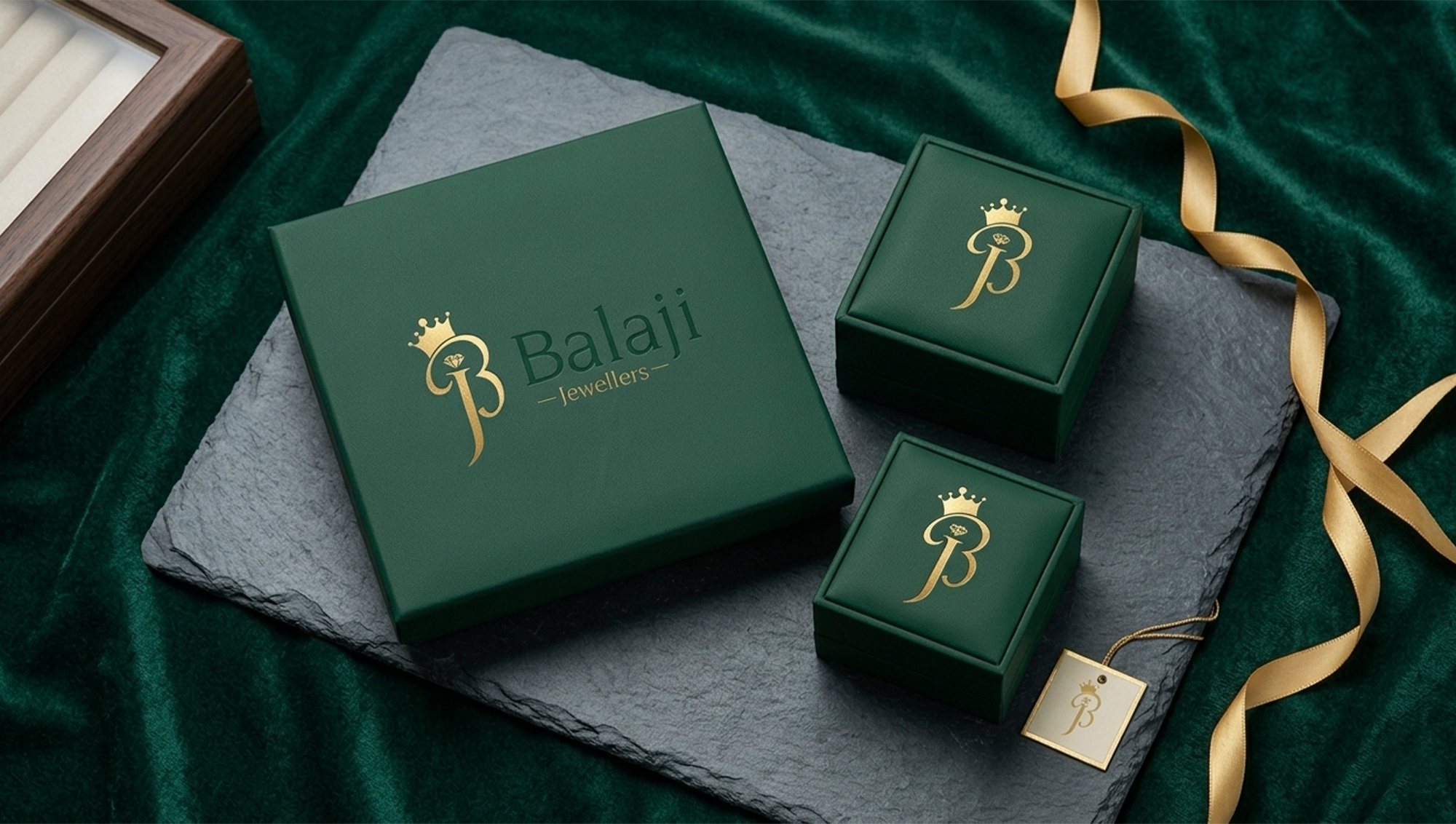
The new identity helped strengthen Balaji Jewellers’ premium positioning and created a more recognizable brand presence across customer touchpoints. The refined visual identity enhanced trust, professionalism, and brand recall.
Positioned prominently on the left side, the golden crown symbolizes royalty, prestige, and excellence. Its elegant form adds a luxurious touch, reinforcing the brand’s identity as a refined and high-quality jewellery business.
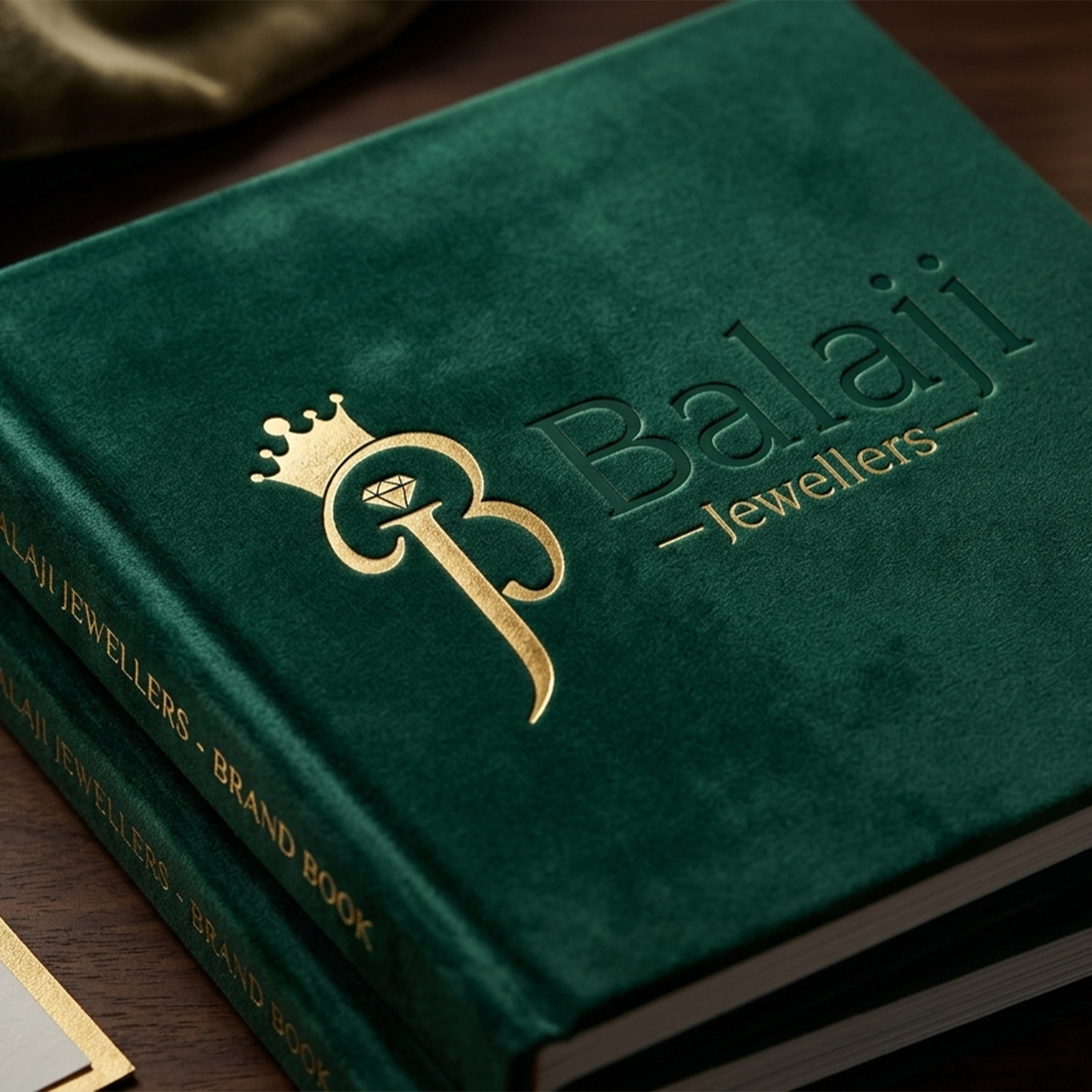
The brand name, “Balaji,” is displayed in a graceful serif typeface, creating a sense of sophistication and trust. The tall, refined letterforms give the logo a timeless and premium appearance, while “Jewellers” is written in a smaller, elegant font that complements the main wordmark and adds balance to the design.
A diamond icon is placed within the monogram, subtly highlighting the brand’s focus on fine jewellery. This detail immediately communicates luxury, craftsmanship, and value, making the logo more relevant to the jewellery industry.
The stylized B monogram on the left creates a distinctive and memorable identity. Its flowing shape gives the logo a handcrafted yet regal feel, helping the brand stand out while maintaining a sophisticated look.
The logo uses a combination of gold and deep green tones. The gold represents wealth, elegance, and premium quality, while the dark green adds depth, tradition, and a sense of trust. Together, these colors create a classy and luxurious visual identity.
The logo presents Balaji Jewellers as a prestigious and trustworthy brand. Its combination of royal symbolism, elegant typography, and refined colors effectively communicates luxury, heritage, and craftsmanship.
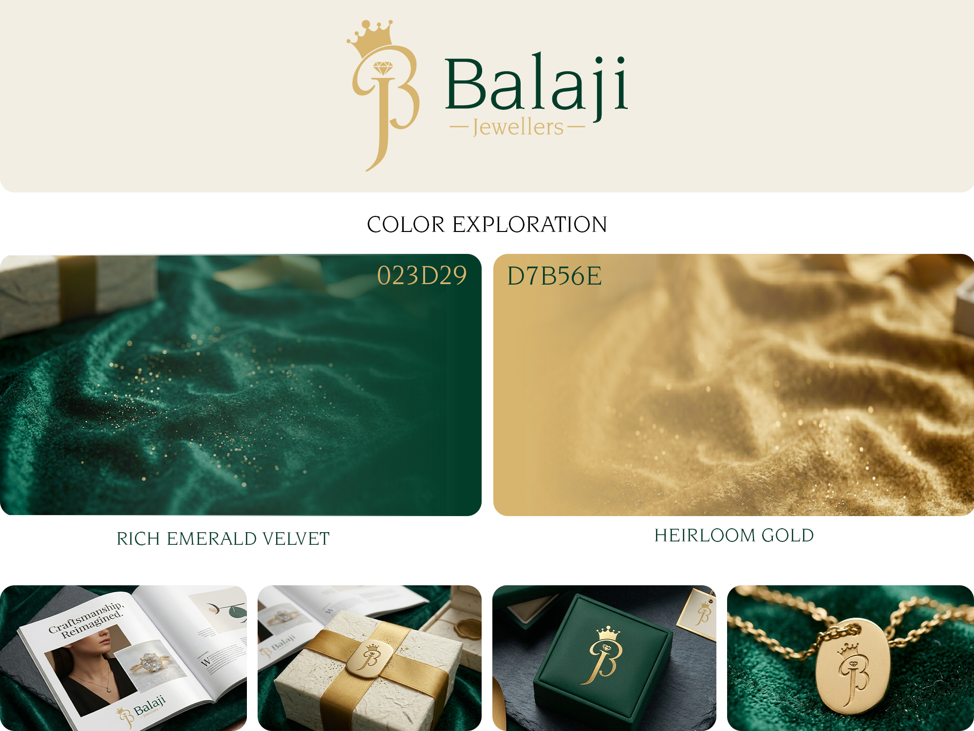
To establish a visual narrative of timeless luxury and premium craftsmanship for Balaji Jewellers, I developed a high-contrast, sophisticated color identity that bridges cultural heritage with modern elegance. The brand architecture relies on two core pillars: Deep Emerald Velvet (#023D29), deployed strategically to evoke opulence, trust, and the plush, high-end environment of a luxury boutique, and Heirloom Gold (#D7B56E), a refined, warm metallic hue selected to mimic the subtle radiance of polished brass and antique gold without feeling overly saturated. This color system was engineered with physical execution in mind; by prioritizing high-contrast materiality, the palette seamlessly transitions from digital interfaces to tactile brand touchpoints—including gold-leaf silk ribbons, blind-debossed retail packaging, and premium textured stationery—ensuring an unmistakably premium, 360-degree brand experience.
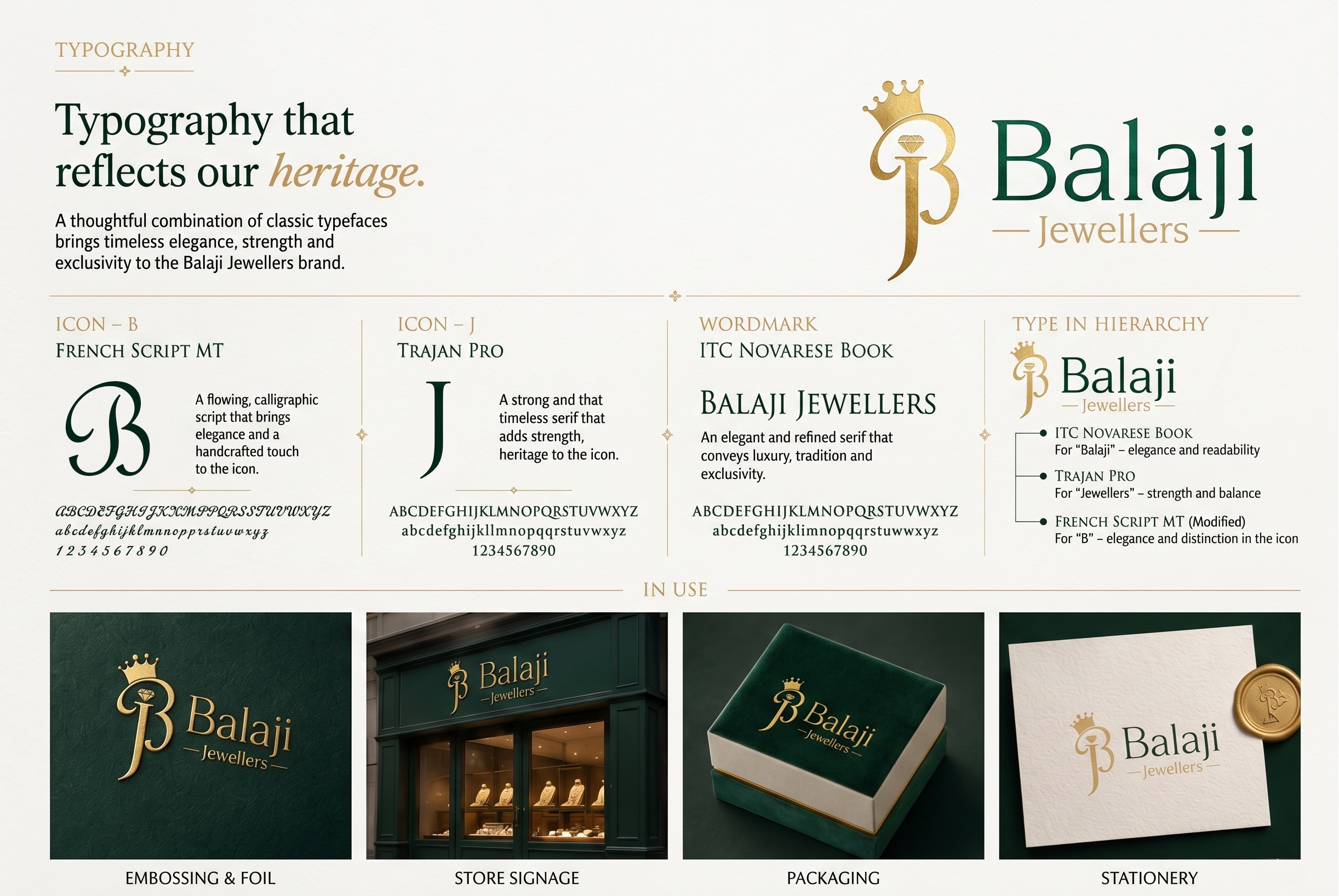
The typography for Balaji Jewellers was engineered to reflect a balance between organic fluidity and rigid structural permanence. To achieve this, I curated a distinct typographic system that separates the bespoke mark from the editorial brand logotype, establishing a clear visual hierarchy.
The Custom Monogram (B & J): For the core icon, I chose to contrast two distinct design eras. The 'B' is built from a modified French Script MT, heavily tweaked to introduce elegant, fluid flourishes that give the logo its artistic, hand-crafted feel. To anchor these flowing curves, the 'J' is rendered in Trajan Pro, bringing the timeless, rock-solid proportions of Roman stonecarving into the composition. Blending these two typefaces allowed me to seamlessly merge the concepts of fluid craftsmanship and enduring heritage.
The Logotype (Balaji Jewellers): To ground the fluidity of the monogram, the secondary brand text is set in ITC Novarese Book. This typeface was selected for its clean, sharp serifs and generous character spacing. It provides a contemporary, high-end editorial feel that doesn't compete with the icon, ensuring the full brand name remains highly legible, modern, and perfectly balanced across both print and digital touchpoints.