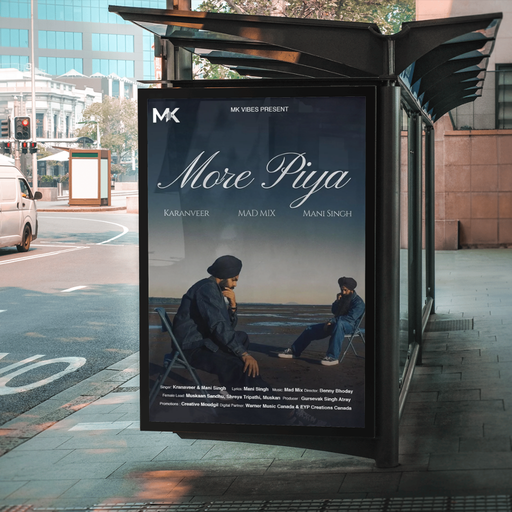
MK Vibes
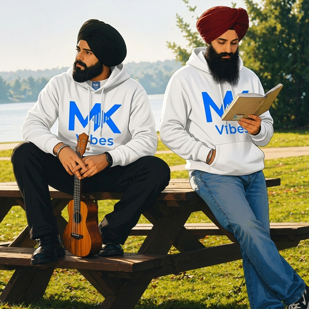
MK Vibes is a YouTube channel started by two passionate artists, Maninder and Karanveer. Their work is a mix of soulful music and real storytelling, inspired by their journey, friendship, and growth as creators. The content carries a modern indie vibe, with heartfelt lyrics and an energetic style that connects easily with listeners. At its core, MK Vibes is about creativity, collaboration, and a genuine love for music that brings people together.
Project Overview
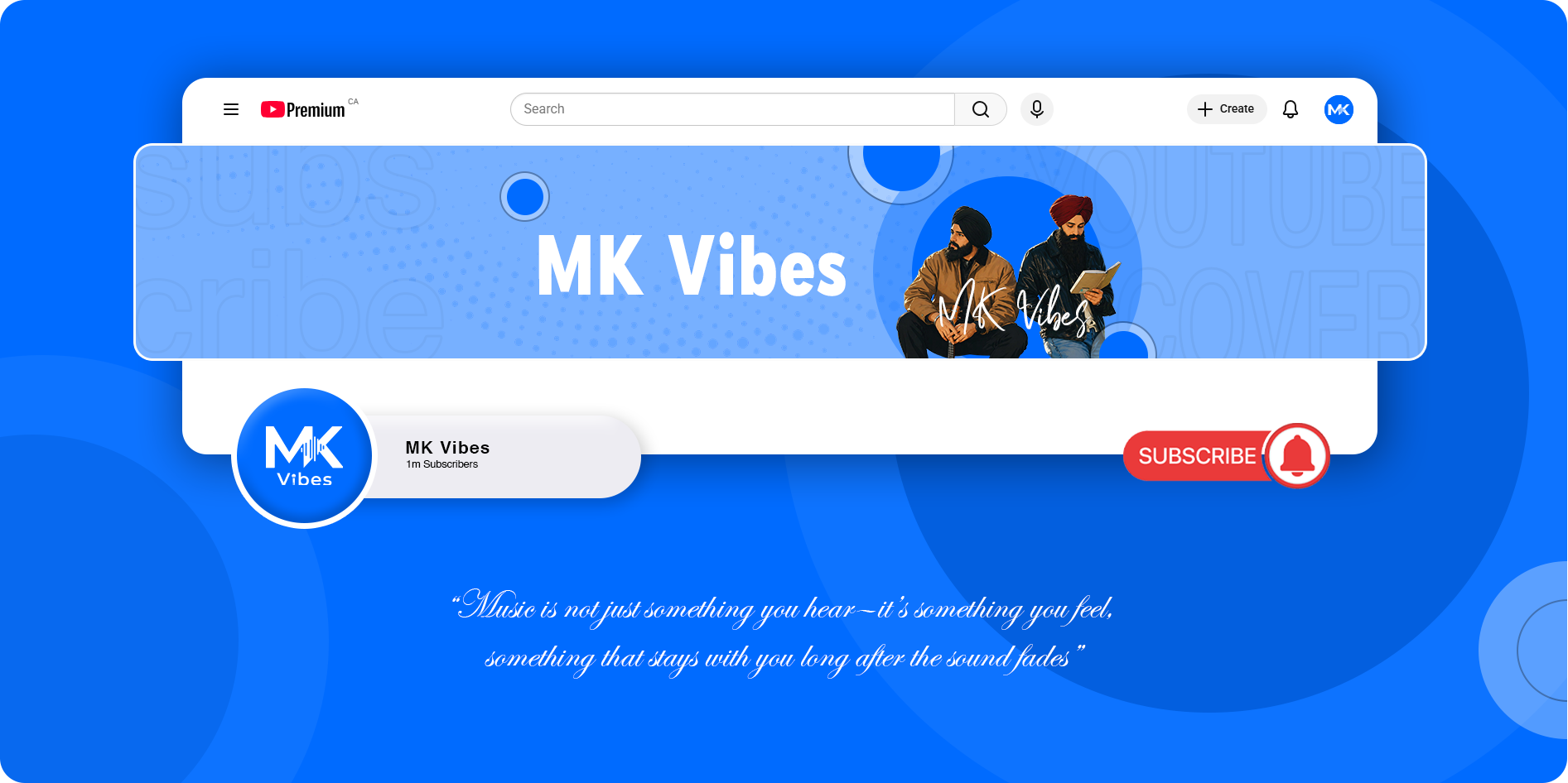
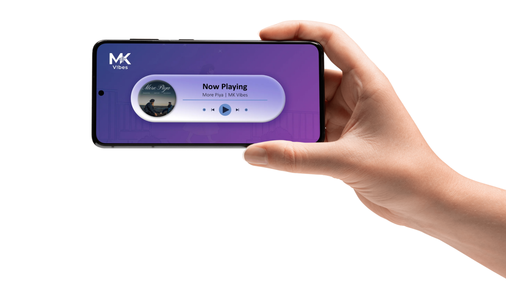
This case study explores the process of developing a visual identity for MK Vibes, a YouTube music channel founded by two artists, Maninder and Karanveer. It highlights how a balanced and minimal design approach was used to reflect both individuality and their shared creative energy. The identity was crafted to capture the essence of their soulful music and storytelling while maintaining a modern indie feel. Special attention was given to creating a versatile design system that works seamlessly across YouTube, social media, and digital platforms. The final outcome establishes a consistent and recognizable presence that aligns with the channel’s core values of creativity, collaboration, and passion for music.
The Challenge
One of the main challenges in this project was creating a visual identity that truly reflected the personality of two artists rather than just one. The brand needed to feel balanced—capturing both individuality and their shared creative energy. At the same time, it was important to maintain a modern indie aesthetic without making it look generic or overly stylized. Another challenge was designing something versatile enough to work across YouTube thumbnails, social media, and promotional content while still remaining recognizable. The goal was to keep it simple and impactful, so it could stand out even in small digital formats.
My Approach
- Focused on understanding the artists’ personality, style, and the emotion behind their music.
- Kept the design minimal to match the modern indie vibe and avoid unnecessary clutter.
- Chose elements that feel youthful, expressive, and easy to connect with.
- Ensured the design works consistently across YouTube, social media, and digital platforms.
Impact & Results
The final identity gave MK Vibes a strong and consistent visual presence across YouTube and social media platforms. It helped the channel stand out with a clear and recognizable style that reflects their music and personality. The design also made their content feel more cohesive and professional, strengthening their connection with the audience and supporting their growth as emerging artists..
Color Palette
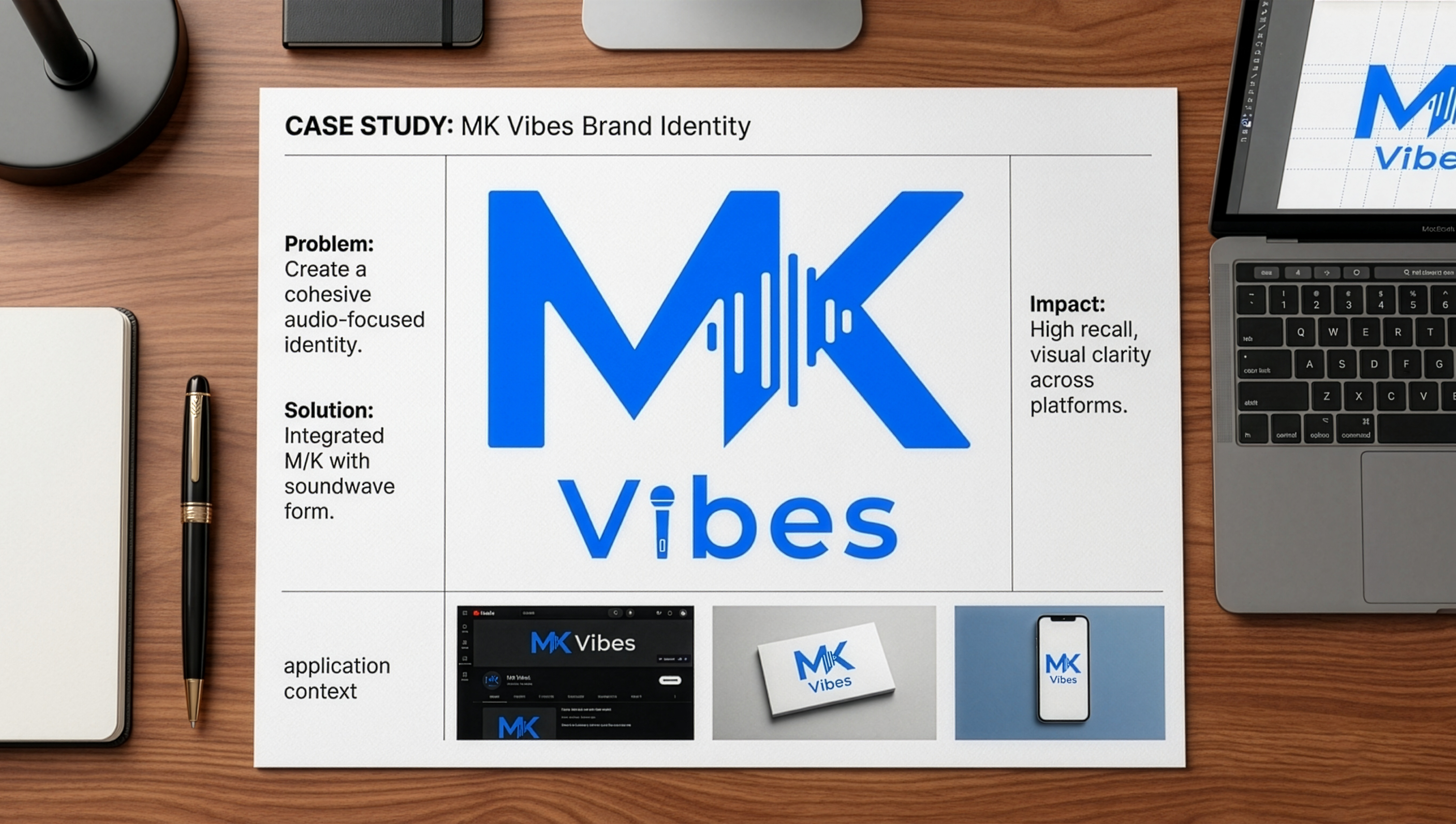
The color palette for MK Vibes is anchored in a vivid electric blue, selected as the primary brand color to establish a strong visual identity within a highly competitive digital space. This hue sits at the intersection of vibrancy and clarity, allowing the brand to command attention while maintaining a clean and contemporary aesthetic. From a color psychology perspective, blue conveys trust, depth, and stability, which grounds the brand’s expressive and emotional nature. At the same time, its higher saturation introduces a sense of energy and movement—qualities that closely align with music, rhythm, and creative flow. This balance makes it particularly effective for a platform built around storytelling and sound. Strategically, using a single dominant color reinforces brand recall and ensures visual consistency across all touchpoints. It simplifies the design system while allowing the identity to remain bold, scalable, and instantly recognizable across digital environments.
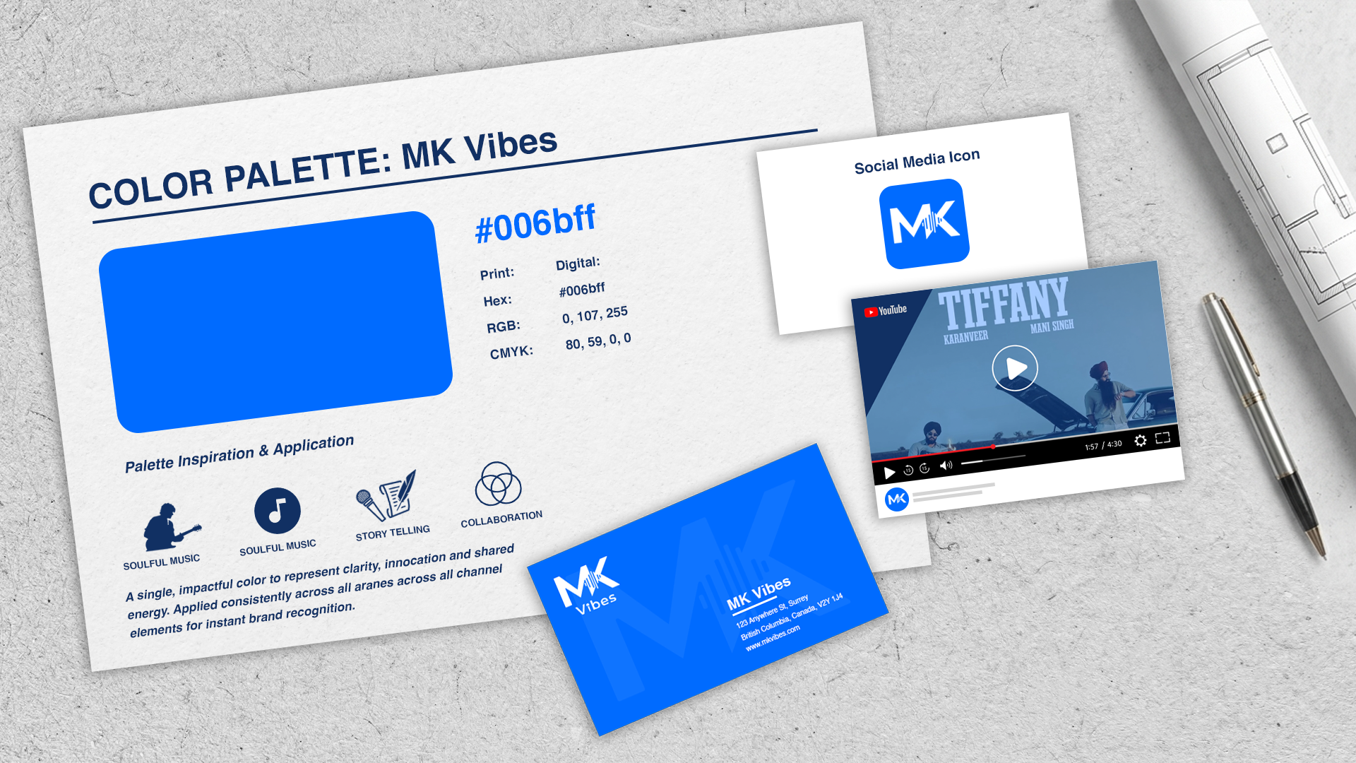
The logo was designed with versatility and scalability in mind, ensuring that it maintains its clarity and visual impact across different platforms and applications. Whether used on digital media, social platforms, print materials, or promotional assets, the identity remains consistent and recognizable. The design elements were carefully balanced to create a clean and professional appearance while preserving strong brand recall. Typography, spacing, and symbolic elements were refined to ensure readability and adaptability at various sizes, allowing the logo to function seamlessly across both modern digital environments and traditional print formats.