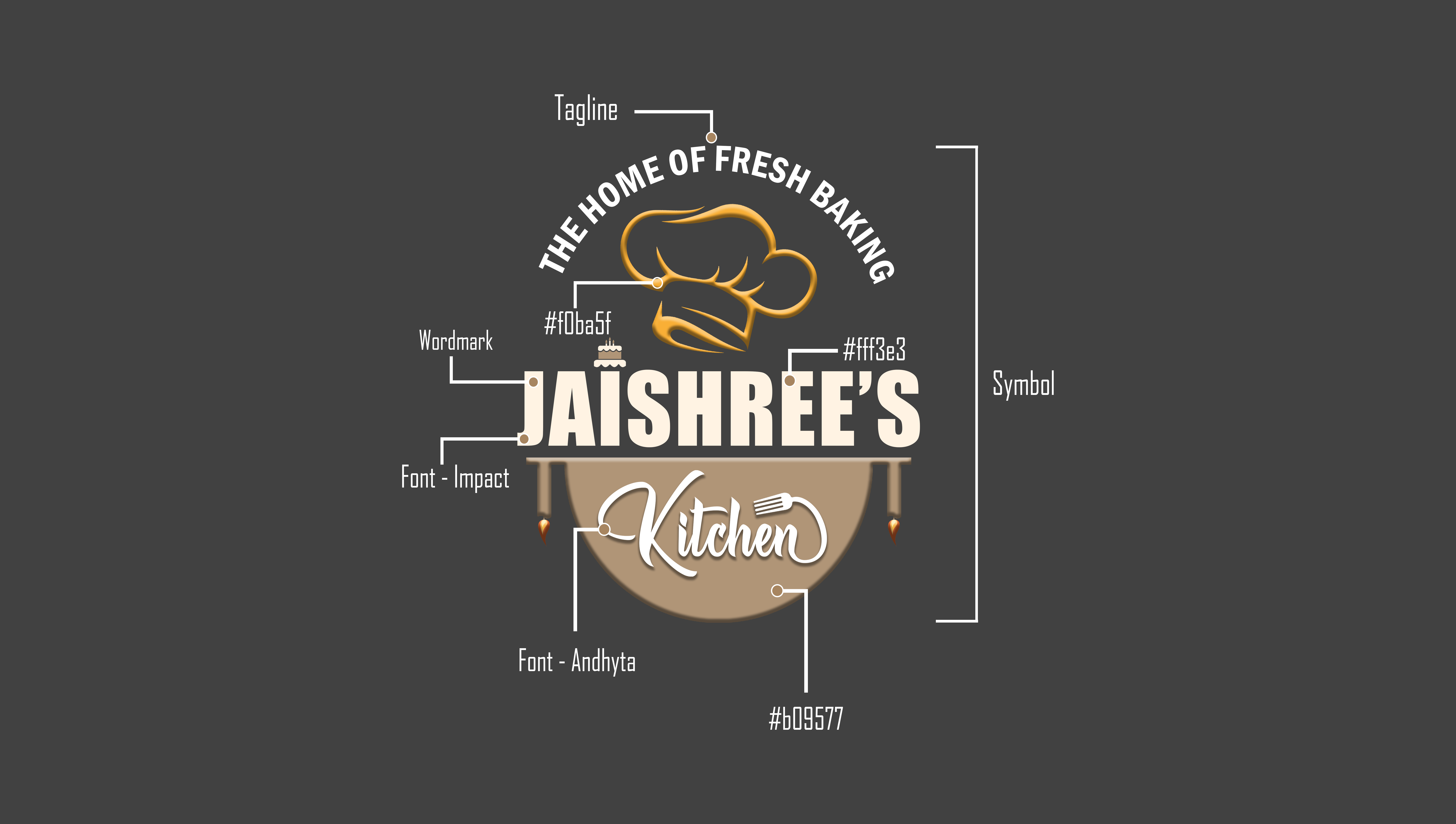
Chef Hat Icon
Positioned prominently at the top, the golden chef hat symbolizes culinary expertise and professionalism. Its elegant curves add a touch of sophistication, reinforcing the premium quality of the baked goods.

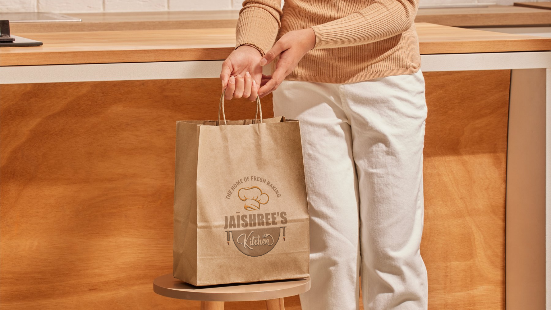
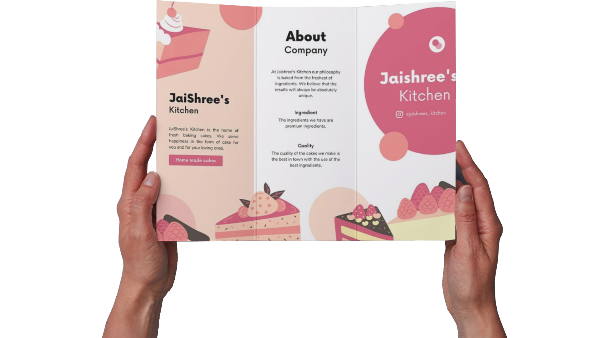
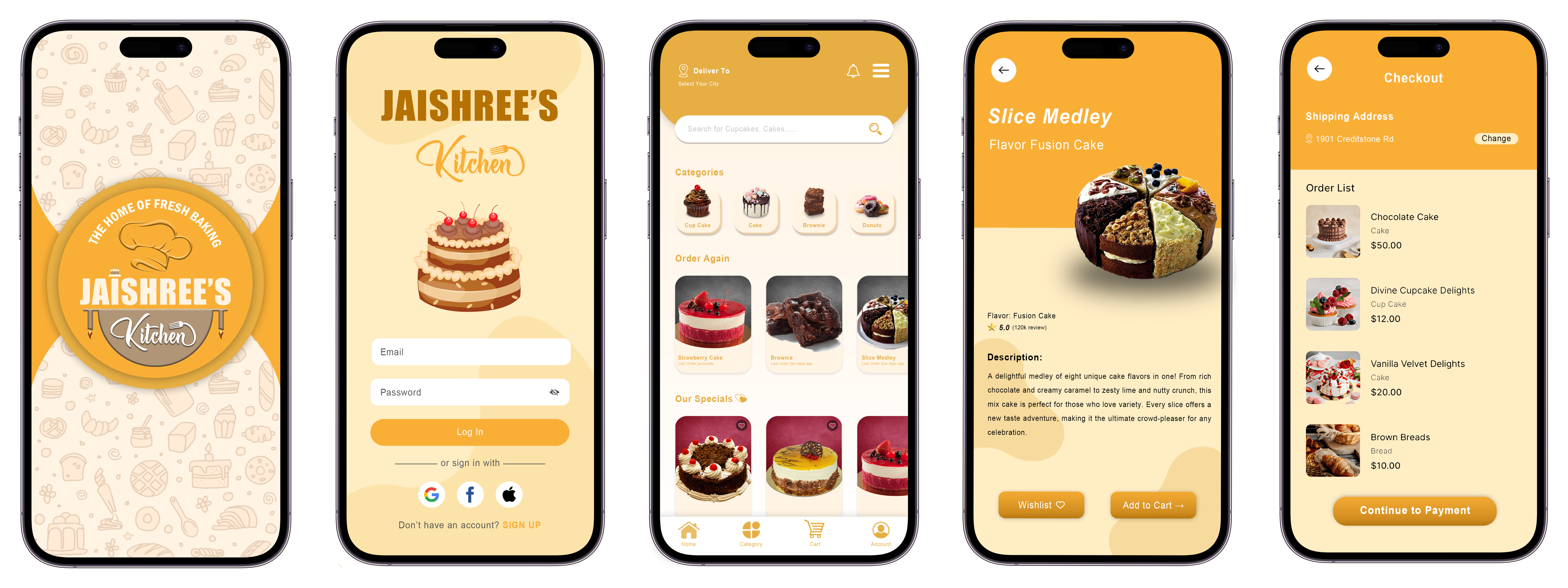
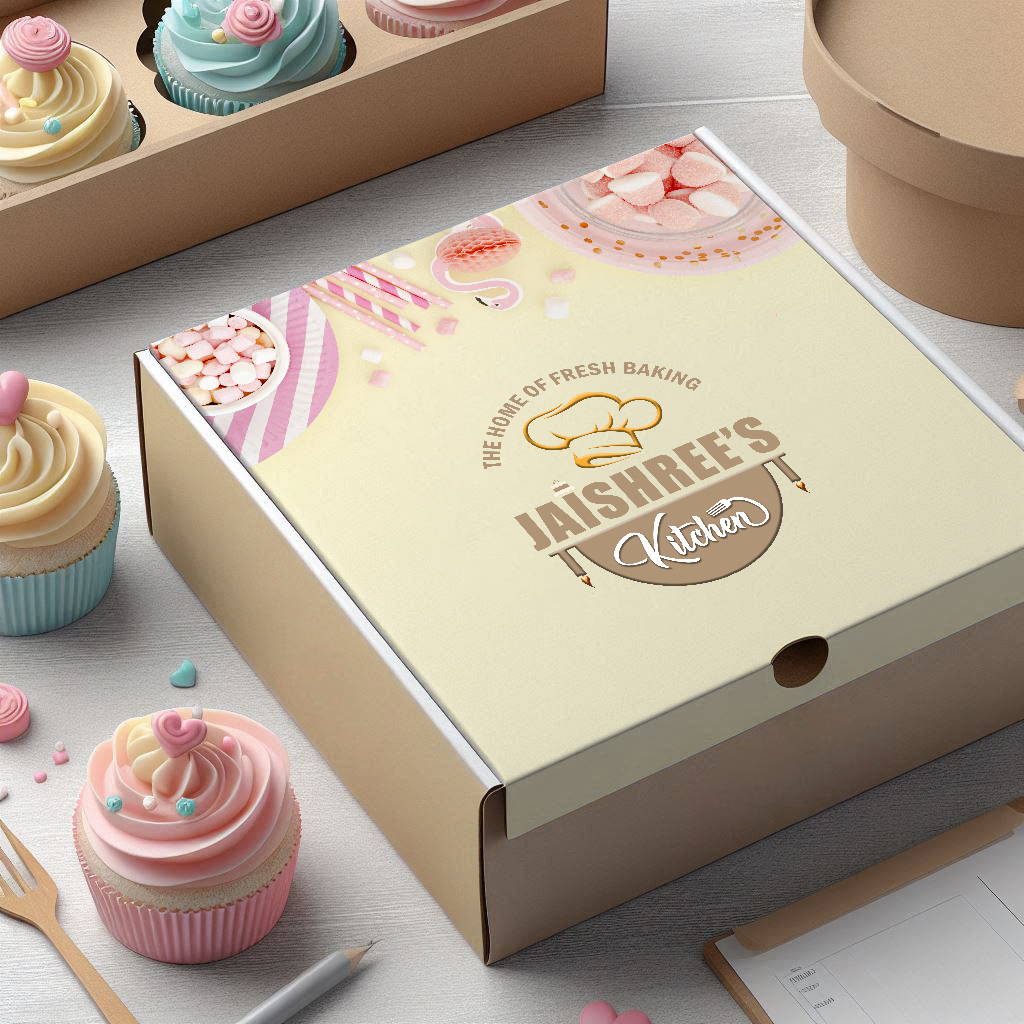
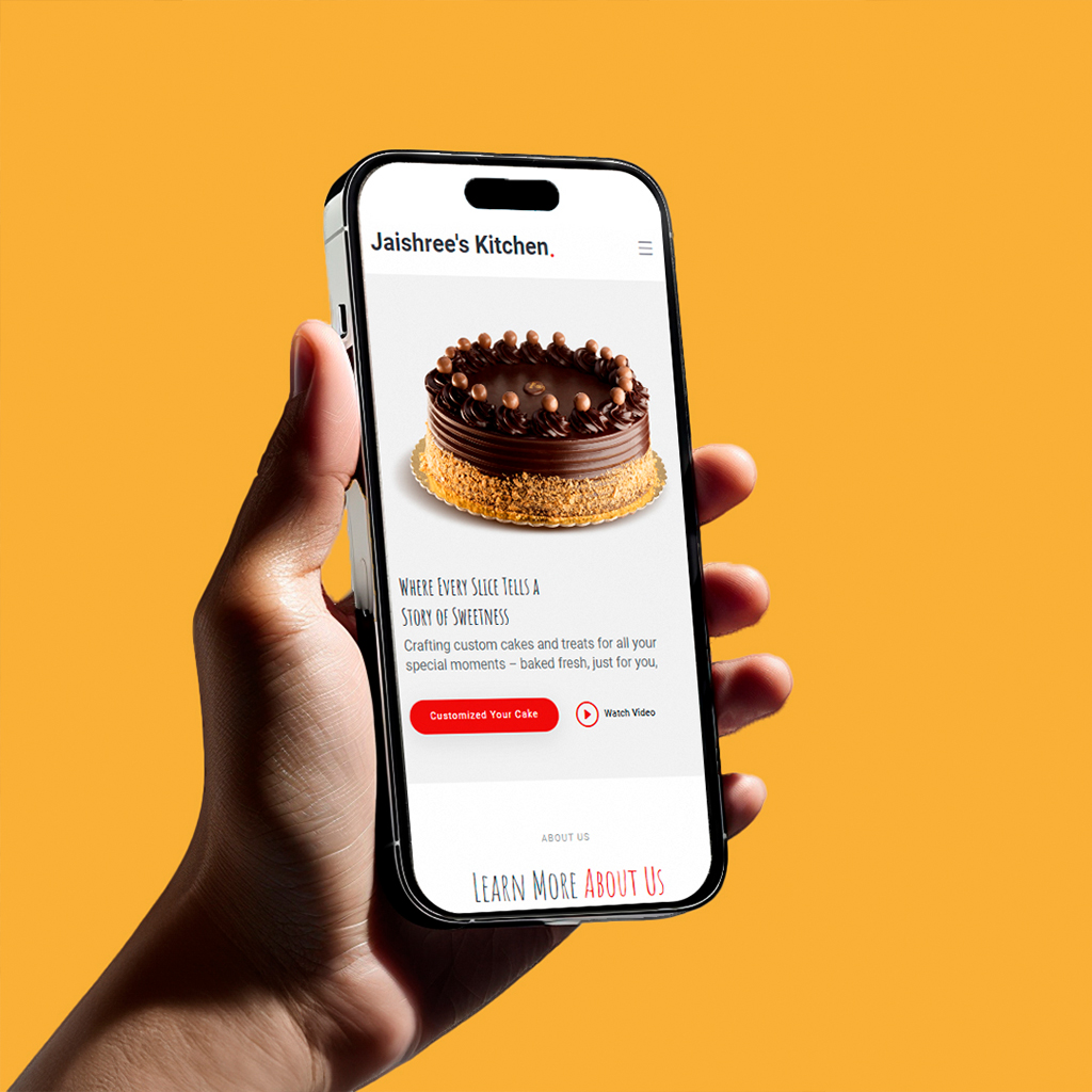
Jaishree's Kitchen is a premium homemade bakery specialising in customized cakes and cupcakes. Known as "The Home of Fresh Baking," the brand combines the warmth of homemade treats with the finesse of professional artistry. Each product is crafted passionately, using high-quality ingredients to deliver a perfect blend of flavour and design. From elegant birthday cakes to themed cupcakes, Jaishree's Kitchen excels in creating bespoke baked goods that bring joy to every celebration. Their ability to customize designs based on clients' preferences makes them a go-to choice for special occasions like weddings, anniversaries, baby showers, and corporate events.
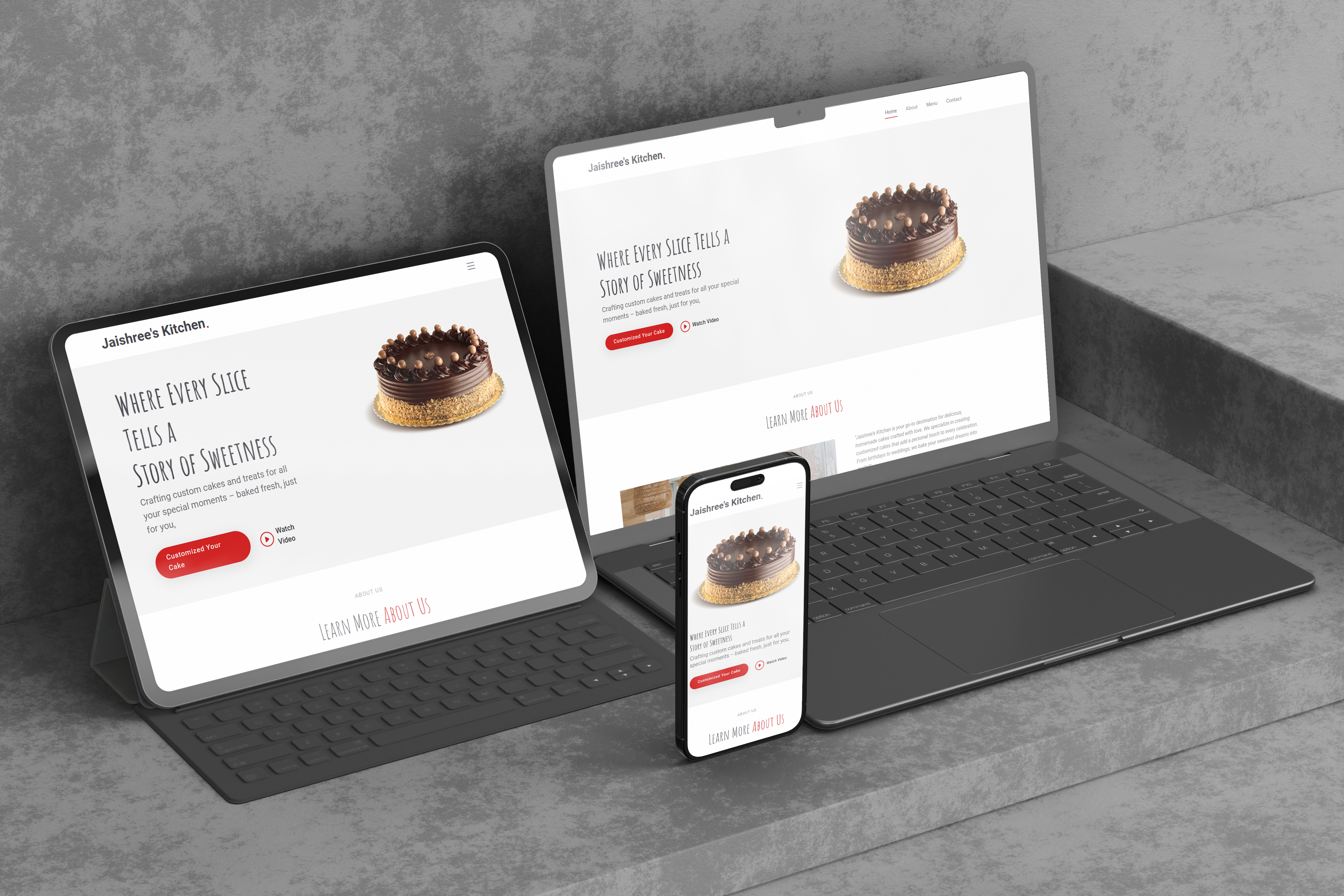
"For this project, I aimed to deliver a visually striking and timeless platform that would stand out and effectively communicate the client's message. Understanding the importance of the project, I set clear goals and milestones to ensure effective results. My focus was on creating a design that differentiates itself from competitors and clearly conveys what the client offers. Throughout the process, I remained determined to achieve a solution that met both aesthetic and functional needs."
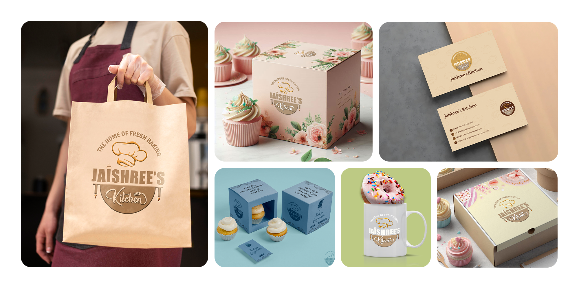
Designing the visual identity for Jaishree's Kitchen, a homemade cake bakery, came with its own set of creative and strategic challenges. The brand needed to convey warmth, freshness, and artisanal quality while standing out in a saturated market of home-based baking ventures. The logo had to encapsulate the spirit of homemade indulgence—inviting yet professional, playful yet refined. It also needed to be versatile enough to work across packaging, social media, and digital platforms without losing its charm or clarity. Striking the right balance between elegance and approachability was key, especially for a business rooted in personal touch and handcrafted goodness.
The branding for Jaishree's Kitchen helped transform a small home bakery into a recognizable local favorite. The logo’s warm, handcrafted feel boosted customer trust and made the business stand out across packaging and social media.
Positioned prominently at the top, the golden chef hat symbolizes culinary expertise and professionalism. Its elegant curves add a touch of sophistication, reinforcing the premium quality of the baked goods.
The brand name, "JAISHREE'S," is displayed in bold, uppercase letters, ensuring strong visibility and a commanding presence. The clean and modern font conveys reliability and trustworthiness. The word "Kitchen" is written in a stylish script font, adding a personal and artistic touch that aligns with the handcrafted nature of the products.
A small cake icon integrated above the "I" in "JAISHREE'S" subtly emphasizes the bakery's specialization in cakes. This detail immediately communicates the brand's niche to the audience.
The tagline, "The Home of Fresh Baking," arches gracefully above the chef's hat. It encapsulates the brand's core promise of freshness and a homely touch, creating an emotional connection with customers.
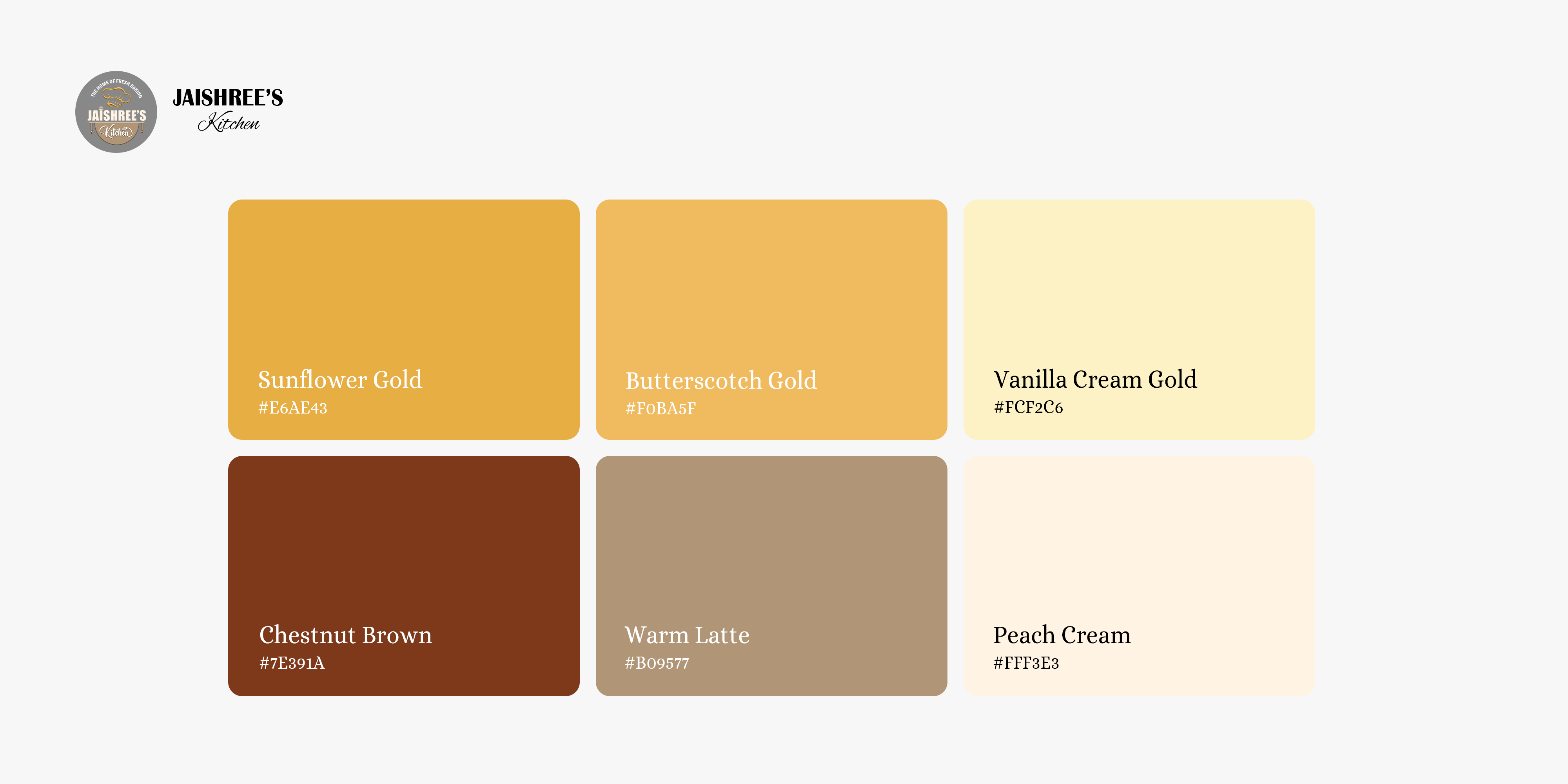
The logo uses a combination of warm beige and golden tones, evoking feelings of warmth, luxury, and indulgence. The neutral brown background complements these colors, reminiscent of baked goods, further reinforcing the brand's identity.
The "N" in "Kitchen" incorporates a fork, subtly tying the design to food and dining. This creative integration showcases attention to detail and adds an element of fun to the logo.
This case study delves into the comprehensive process of logo design, color palette development, and typography selection for digital platforms. It also highlights how these elements were seamlessly integrated into collateral designs to strengthen brand identity and enhance customer engagement.
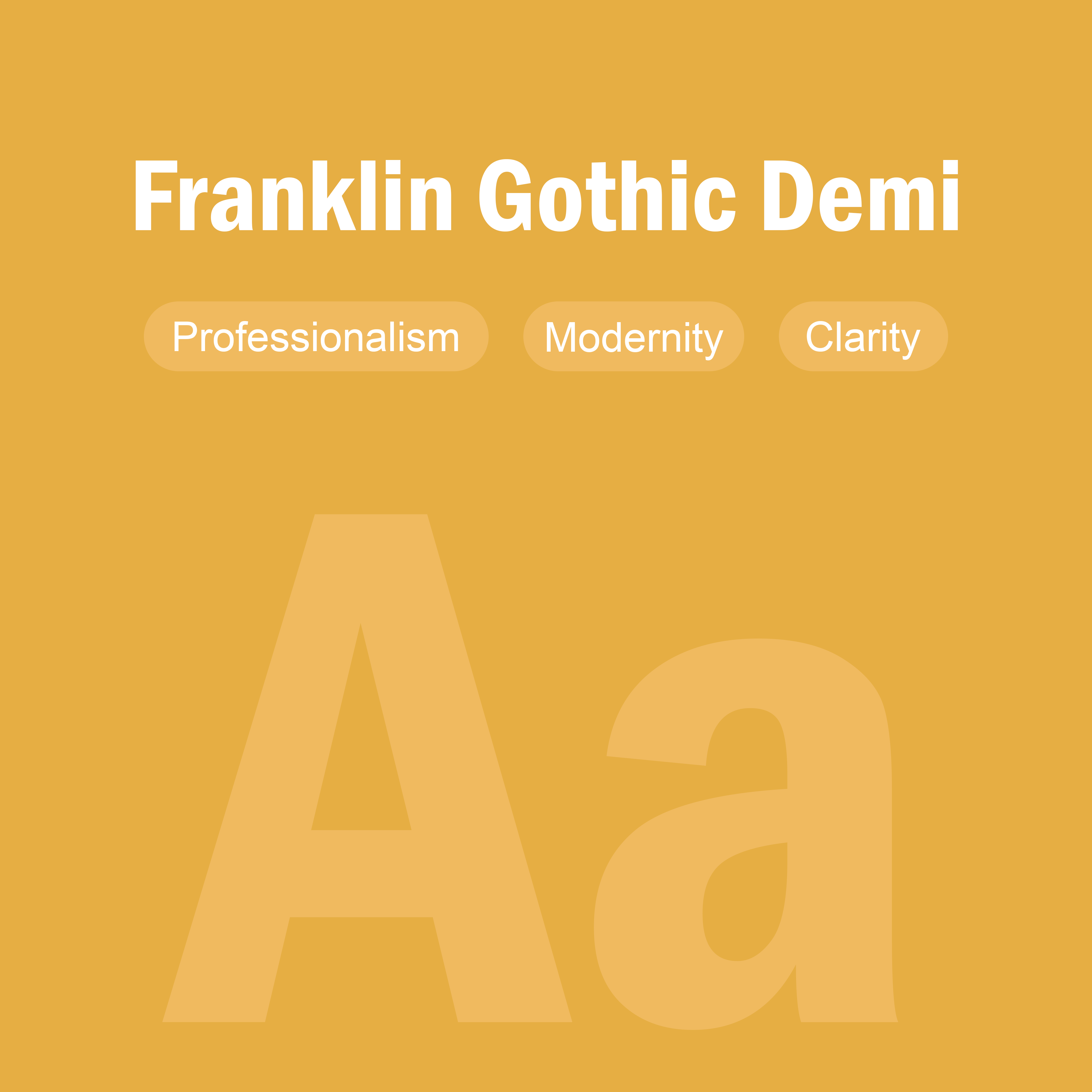
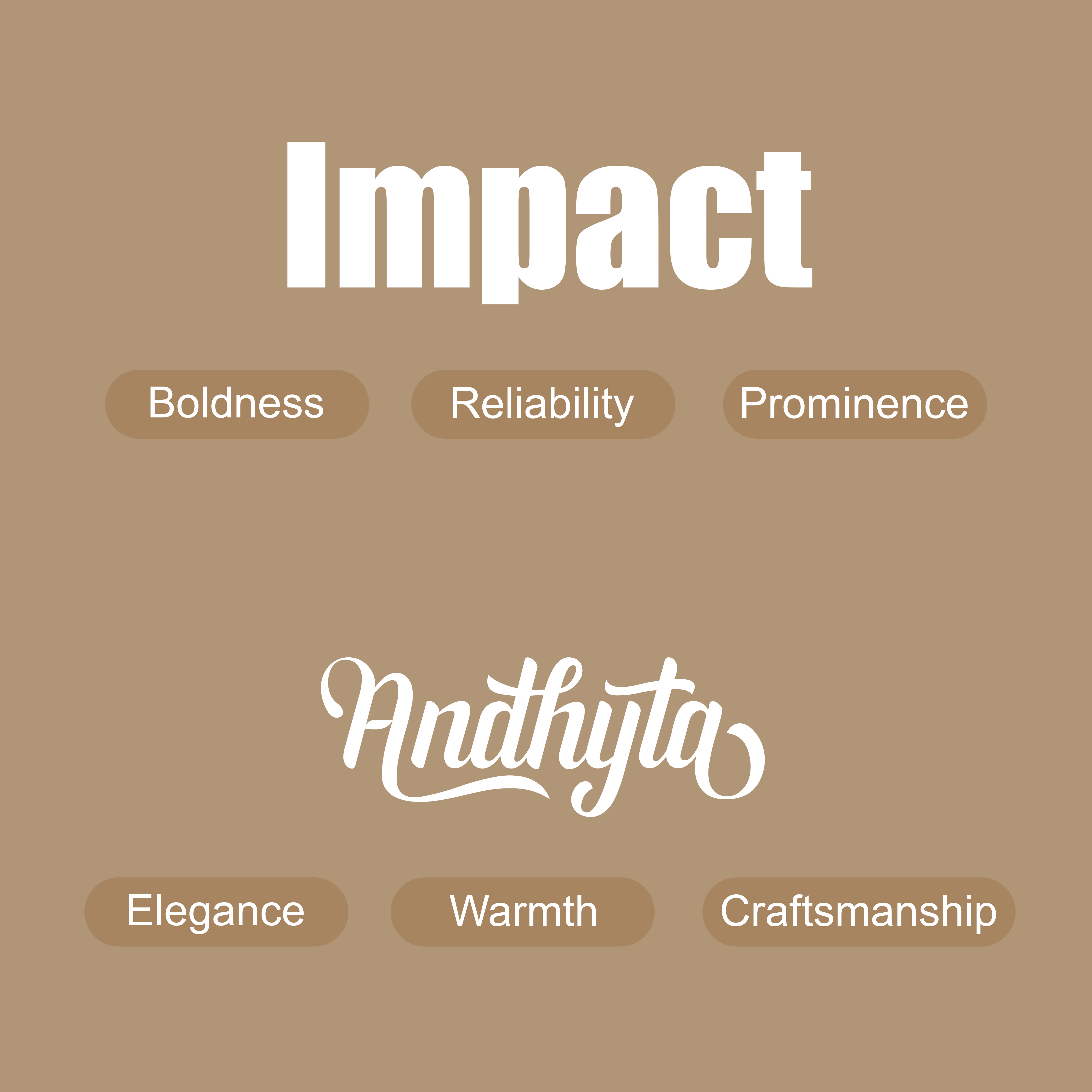
The selection of Impact, Andhyta, and Franklin Gothic Demi Condensed for Jaishree's Kitchen perfectly captures the brand’s essence—bold, artistic, and inviting. Impact, used for "JAISHREE'S," exudes confidence and reliability with its strong, heavy-weight structure, symbolizing the brand’s prominence in homemade baking. Andhyta, featured in "Kitchen," adds an elegant, handwritten flair, reflecting the artistry and warmth of Jaishree's Kitchen while emphasizing the handcrafted nature of their bespoke cakes and cupcakes. Franklin Gothic Demi Condensed, used for the tagline, provides a clean, professional touch, ensuring readability and adding a refined contrast to the other fonts. Together, these typefaces harmonize tradition with creativity, making Jaishree’s Kitchen a brand that stands out while feeling personal and welcoming.
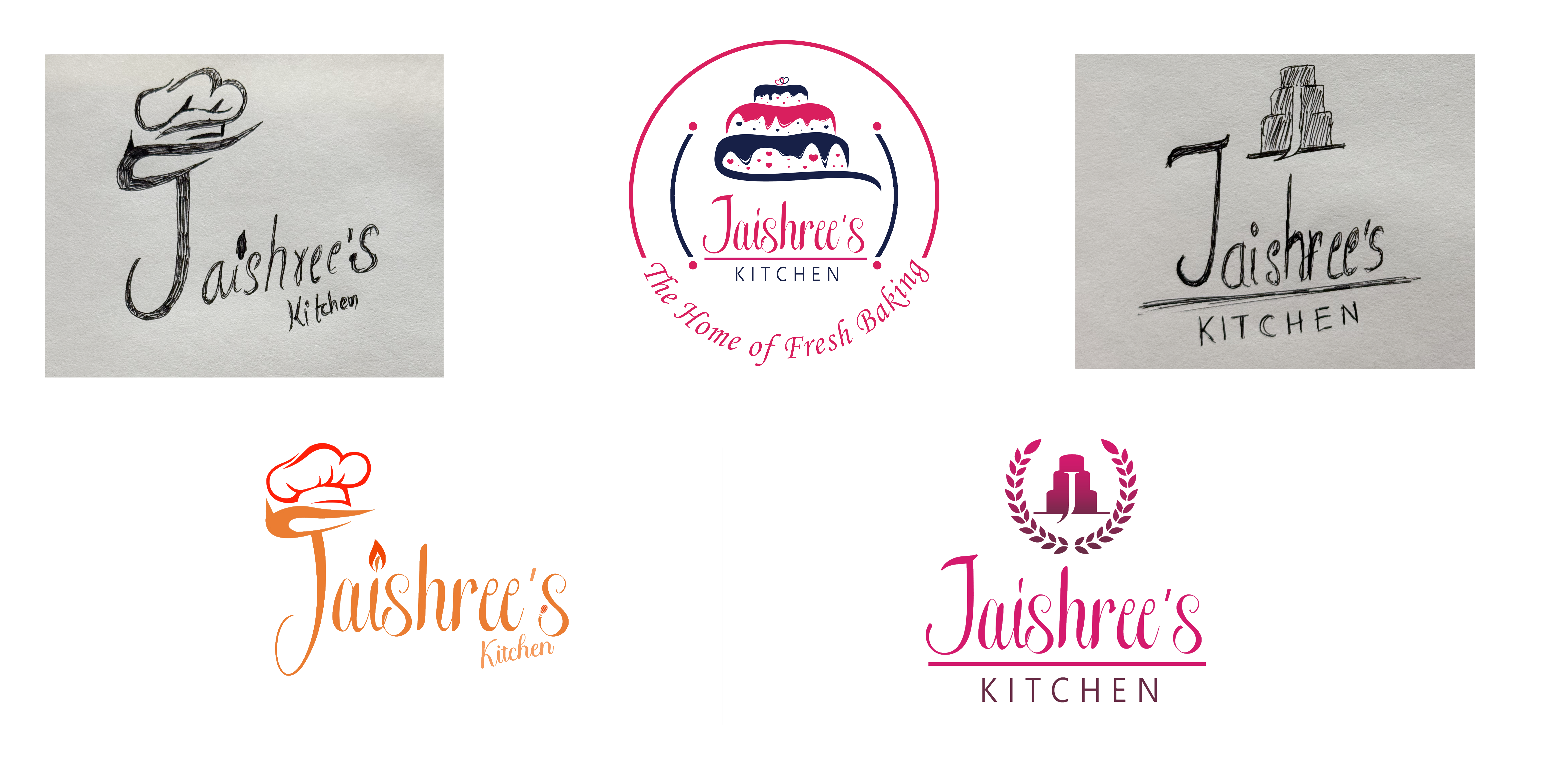
These rough sketches represent the initial conceptualization of the Jaishree's Kitchen logo, exploring various visual elements that capture the essence of homemade baking. The hand-drawn designs experiment with typography and key symbols like a chef’s hat and layered cakes, emphasizing themes of professionalism, warmth, and celebration. The sketches helped refine the brand’s identity by focusing on elegant lettering and recognizable baking-related imagery. As the designs evolved into digital formats, elements such as color psychology and polished typography were incorporated, ensuring versatility and visual appeal. This process highlights the importance of sketching as a foundational step in crafting a strong and cohesive brand identity.